Welcome to the Brand Manual of the apartment project in Caño Cristales, Colombia! This manual was designed to reflect the essence of the project in every aspect.
From the selection of colors to the choice of typography, everything was carefully chosen to convey the project’s image: modernity, innovation, respect for nature, and elegance.
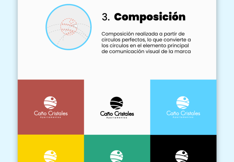
The color palette includes shades of green, yellow, and blue, which evoke the colors of the river that runs near the project. Additionally, geometric shapes were used to give a sense of movement and fluidity, representing the harmony between nature and architectural design.
The chosen typography is modern and legible, allowing information to be conveyed clearly and concisely. The use of high-quality illustrations and photographs helps to visually present the different spaces and common areas.
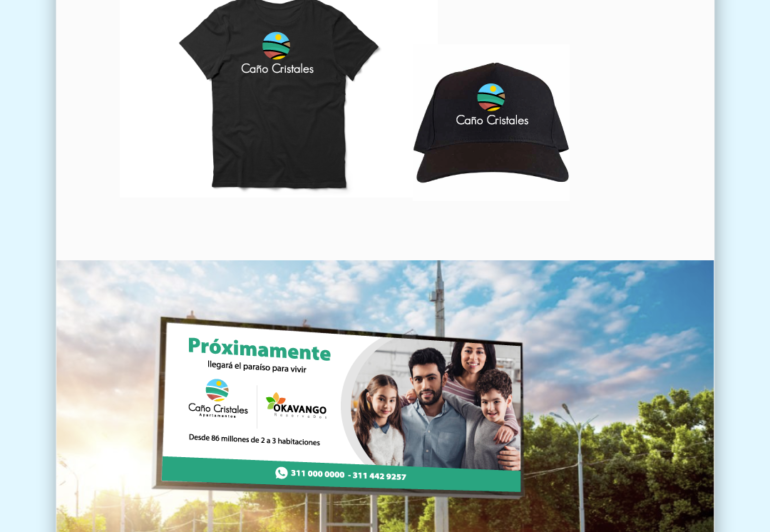
In this manual, you can find guidelines for the correct use of the logo and visual identity to ensure that they are always used consistently in all communications. Recommendations for the selection of materials, finishes, and decorative elements that complement the overall project design are also included.
This Brand Manual represents the essence of the apartment project in Caño Cristales, Colombia, and is an indispensable tool to ensure that the project’s image is consistently and effectively conveyed.
Caño Cristales
24 Mar, 2023


